
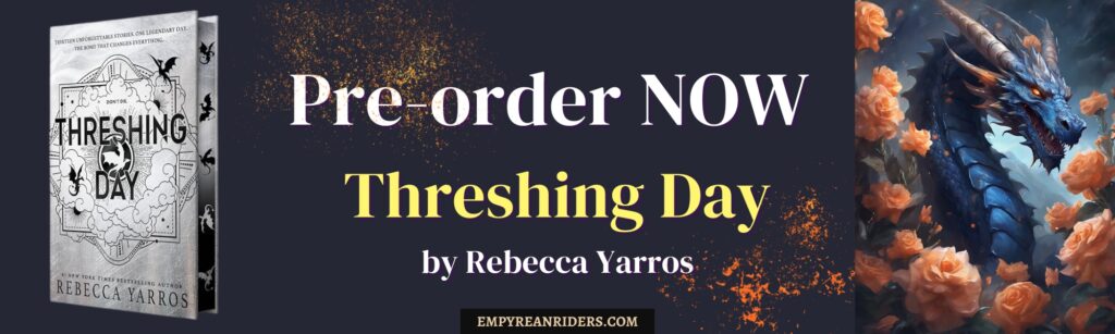
I think Rebecca Yarrros has been giving us plenty of clies about her upcoming books thanks to her book covers. I’ve been wanting to write this theory for you for such a long time, but sadly, because I had to move countries, I couldn’t take my hardcovers with me…so I needed to hunt for them in some special English libraries here.
I am not surprised that Threshing Day Book is silver/slate color. It makes so much sense. And I’m going to explain to you how I imagine this looking like.
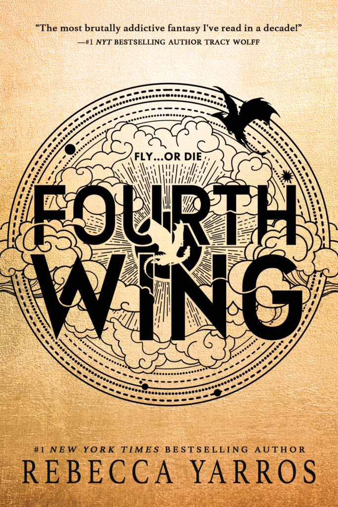
Fourth Wing Book Cover
The colors
The antique gold/cream background resembles old parchment, illuminated manuscripts, medals, and military heraldry. It gives the book a sense of ancient history and prestige, but the uneven, smoky coloring also makes the world feel scorched and war-torn.
I think this is because we are learning about Violet’s mind of a scribe. This is about history and scrolls and the truth.
The dragons
There are two dragon silhouettes:
A much larger dragon flies along the upper edge of the circle. A smaller dragon appears lower down, crossing through the title. On the standard cover of Fourth Wing, Tairn is the massive black dragon at the top. He is soaring above the other dragons, with the smaller, golden-colored Andarna positioned in the center.
The circle, clouds, and sunburst
The enormous circle looks like several things at once:
- a magical seal or protective ward;
- an astronomical chart or astrolabe;
Inside it are clouds and strong rays spreading outward from behind the title. The clouds emphasize flight and the sky, and I think we get a glimpse on what Violet’s signet is. Pure power which manifests as lightning.
Are those marks actually runes?
The small dots, bars, stars, broken lines, and geometric bands are definitely rune-like. Besides, the author did confirm that we have runes on the cover.
Iron Flame Book Cover
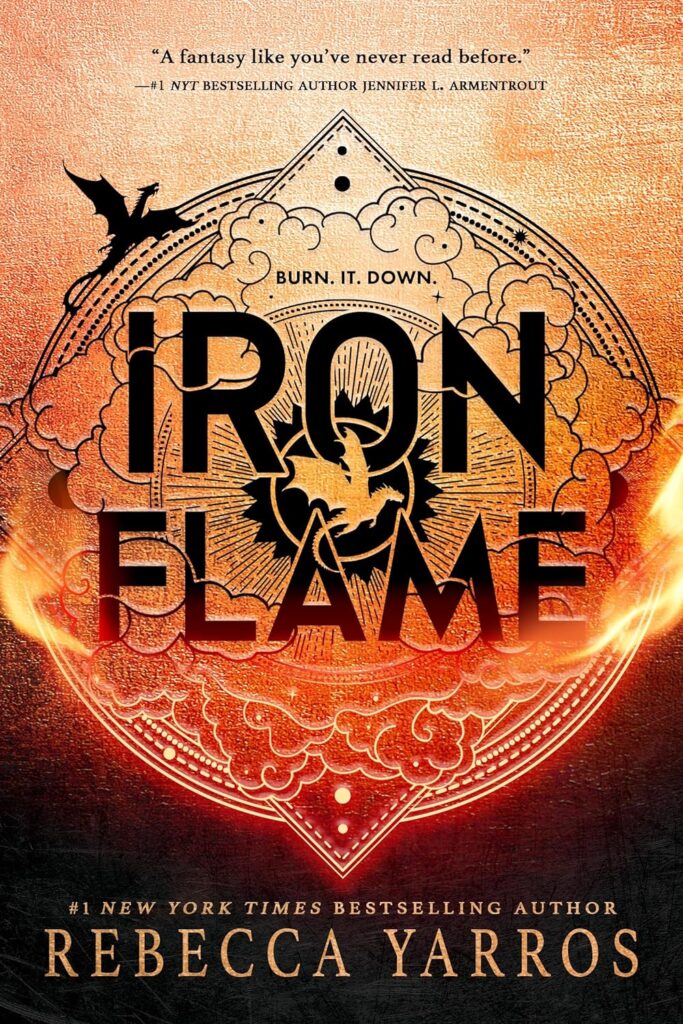
The design clearly continues the visual language of Fourth Wing, but everything now looks hotter, darker, and less stable. That fits the transition from Violet’s first year, surviving and learning the system, to her second year, when she understands what the system is hiding. The official synopsis emphasizes both Violet’s “will of iron” and the danger of secrets buried within Basgiath.
The colors: metal inside a furnace
The background moves from pale copper and orange at the top, through intense red, and finally into near-black at the bottom. It resembles a piece of iron being heated in a forge. Given what the book is about, the cover makes perfect sense. Especially when you think about the black ward stone being literally on fire.
The title lettering
The title is enormous, black and angular. It has the weight of stamped metal, military signage or an official seal. But the letters contain scratches, hatching and interruptions, so the authority they represent does not look perfectly solid.
This suggests two opposing ideas:
Iron as strength: Violet must become harder, more determined and more resistant to manipulation. The official description specifically calls attention to her “will of iron.”
Iron as rigidity: Basgiath and Navarre’s leadership have created a strict system that refuses to adapt, even when the truth threatens it. Iron can be strong, but it can also be inflexible and eventually break under enough pressure.
The phrase “Burn. It. Down.” appears directly above the title. It changes the cover from a general image of fire into something more rebellious. This is not merely a building accidentally catching fire; it implies the destruction of a system, a lie or an established order. The phrase is visibly part of the published cover design. Plus…literally…burn the iron ward stone…
The dragons
We yet again have Tairn on the side and Andarna in the middle of the book. Also notice how the centre of the “sun” is now brighter. Andarna is also much bigger!
The circle and pointed frame
The main emblem begins as a circle but extends into pointed shapes at the top and bottom. It resembles several things simultaneously:
- a magical ward;
- a rune
- a compass or celestial instrument;
On Fourth Wing, the circular design looks relatively balanced and complete. On Iron Flame, fire erupts through its sides, smoke fills its interior and the lower point descends into darkness. The structure is still present, but it appears to be under attack.
A useful symbolic reading is that the circle represents protection and controlled knowledge. The flames breaking across it represent the failure of that protection—or the revelation that it was never as secure as people believed.
The “runes”
The small dots, parallel lines, triangles, stars and concentric bands look rune-like, but they do not appear to form a readable alphabet (yet).
They function more like magical notation:
- The dots resemble points where energy might be anchored.
- The nested rings resemble barriers or layers of protection.
- The triangle at the top resembles a directional marker, flame point or mountain?
- The sharp lower point makes the whole design look like a shield, blade or suspended crystal.
- The repeated fine lines resemble engraved metal or magical circuitry.
Rebecca Yarros did confirm these are runes…but for what? Why did they change? The rune is becoming more and more complex.
Also please note the East and West for the black suns. The book starts with a “black sun” and ends in a “black sun” something we did not have in Fourth Wing.
Onyx Storm cover
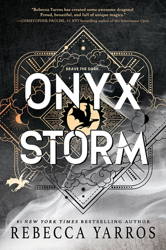
It continues the same symbolic design used for Fourth Wing and Iron Flame, but the mood changes again: the first cover looks scratched and it goes from black to silver. We are seeing shadows or smoke. But it’s the scratches that interest me the most. And the silver corner on the right hand side which almost looks like metal, or ice.
The colors: onyx, lightning, and fading certainty
The strongest feature is the transition from deep black at the top to silver-white at the bottom. This closely suits the title: onyx is traditionally associated with black stone, while true onyx is often characterized by contrasting bands, especially black and white.
The palette therefore works on several levels:
- Black represents night, shadow, secrecy, corruption and the unknown. Basically Xaden’s new soul too…
- White and silver suggest lightning, as well as Violet’s hair color.
Unlike Iron Flame, there is very little warmth. The red-orange furnace has cooled into a black-and-white storm. That makes the danger feel less direct but more disorienting. Fire is visible—you know where it is. A storm surrounds you, blocks your vision and can come from every direction.
The movement from black into pale gray may also represent uncertainty between moral extremes. The world is no longer easily divided into heroes and enemies, truth and lies, or safety and danger. Everything becomes foggy in the middle.
The white title
ONYX STORM appears in huge white lettering against the dark background. At first, that makes the title seem like the brightest and clearest part of the cover.
But the letters are not perfectly clean. They are crossed by black lines, gray fragments, clouds and a sharp diagonal flash. Parts of the words appear obscured or fractured.
The cover therefore keeps reversing expectations. Darkness contains light, light contains shadow, and neither side remains untouched by the other.
“Brave the dark”
The previous cover’s phrase, “Burn. It. Down.”, was aggressive and outward-facing. It demanded action against a corrupt structure.
The central dragon
A large black dragon silhouette appears in the center, surrounded by a gold circular shape. Because the dragon is black against gold, it looks almost like an eclipse, a dark body passing in front of a sun or moon. Of course, we know that Tairn is centre stage here and Andarna is much more to the side.
The dragon does not merely fly above the weather. It appears embedded within the clouds, geometry and title. Dragon power is now part of the storm itself.
The smaller dragon
A much smaller pale-gold dragon appears toward the lower-left portion of the cover. It is separated from the large central silhouette and flies through the lighter part of the storm. Separated because in Onyx Storm, she does leave…
The contrast can also represent known power versus undiscovered power. The large dragon dominates the image, but the smaller one may be traveling toward something beyond the familiar structure.
The storm clouds
The clouds are thickest through the middle of the design, precisely where the title, dragons and magical symbols overlap.
The clouds also seem to cross the border of the emblem. Like the flames on Iron Flame, the storm cannot be neatly contained by the geometric system surrounding it.
There is an escalation across the three covers:
- Fourth Wing: the dragons move around an apparently stable ancient seal.
- Iron Flame: fire begins breaking through the seal.
- Onyx Storm: the central design is largely obscured by clouds and darkness.
The runes
The basic circular seal from the first books has developed into a more elaborate combination of:
- circles;
- diamonds;
- upward- and downward-pointing triangles;
- parallel lines;
- starbursts;
- dotted borders.
The rune is becoming extremely complex. This is my interpretation:
- Dots resemble power anchors or stars on a chart.
- Parallel lines resemble engraved channels for magic.
- Nested borders resemble layers of wards.
- Triangles suggest direction or elemental forces.
- Circular forms suggest cycles, protection and completeness.
- Broken or hidden sections suggest damaged knowledge.
Please also take note of the suns. Left sun is now shining and glowing and the right one is black once again.
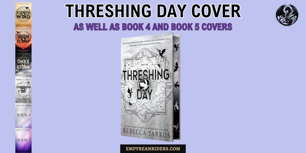
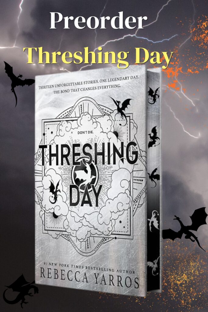
Threshing Day Cover
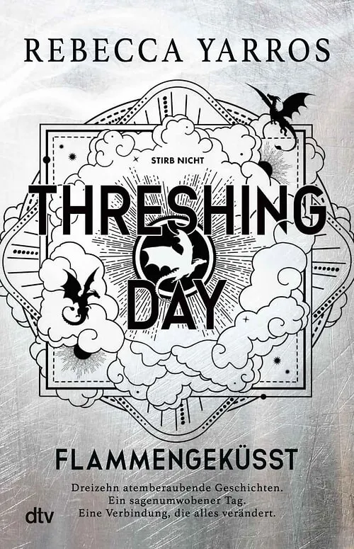
Naturally, the Threshing Day cover will fit beautifully the collection so far. I don’t have a 2D cover in English, I only found one in German hehe.
The cover is almost completely monochrome:
- Silver and pale gray dominate the background.
- Black is used for the title, dragons, borders, and shadows.
- White fills the clouds and creates negative space.
The silver surface resembles scratched metal, frost, stone, or heavily marked training-ground material. It feels physically damaged rather than smooth and ceremonial.
You have the silvery shadows on the left top corner and the harsh slate metal to the bottom right corner. The same scratches and marks are present.
The scratched background
The surface is covered with thin white scratches and intersecting marks. They could resemble:
- claw marks;
- ice marks
- scars;
As far as I’m concerned, we have two characters definitively confirmed for this book: Xaden, as the author herself promised, and Ridoc, based on another one of her posts.
So, could the top-left corner represent Xaden’s shadows, while the bottom-right represents ice—as in Ridoc?
The clouds
Huge white clouds occupy most of the central image. They curl around the title and obscure portions of the geometric design.
The central dragon medallion
Between the two parts of the title is a circular black emblem containing a white dragon. Also note that the centre “sun” is now completely different. It has a white and a black circle around. Multi-layered…interesting.
The dragon is presented through negative space. It is white because its shape has effectively been cut out of the darkness.
The other dragons
There are two additional black dragons are clearly visible on the front:
- One flies or lands near the upper-right corner.
- Another curves upward from the lower-left side.
More dragon silhouettes continue along the spine.
Unlike the previous covers, these dragons do not appear as an obvious large-and-small pair. That is a major change. Please also note how different their tails are…It’s fair to assume that we have a dagger tail right in the middle of the book: Sgaeyl.
Dragons can have club tails, scorpion tails, sword tails, morningstar tails, daggertails, or feather tails (when not yet adults). So looking at the cover, I can see a club tail but I am not entirely sure about the top right corner? We do know that Aaric has a blue clubtail tho. But so does Tene, Feirge, Aimsir and Fuil.
The dots, bars, and “runes”
As with the other covers, the small marks are rune-like. This is extremely complex and a clear evolution from the other books. Our rune is trying to tell us something…
Please also note the suns. They are not West and East but South West and North East, both of them being glowing black.
Book 4 Cover
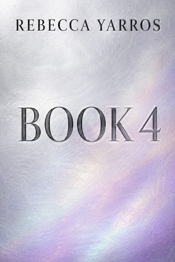
I think Book 4 is going to transition from silver into a soft, iridescent purple. I also think Tairn will be in the middle again, with Andarna positioned off to the side.
My theory is that the book will focus on the missing hours when Violet was away, and that we’ll finally learn more about the irids. I think we’ll begin to understand how dragon bonds are formed, what they truly entail, and what happens beneath the surface of those connections. It would also be fascinating to learn more about where Andarna went and what she discovered while she was gone.
I also believe the story will take us to other islands and begin introducing the gods much more prominently. I have a feeling that both Violet and Xaden will have to meet Malek in one way or another.
Rebecca Yarros has said that her favorite dragon is Tairn and her favorite god is Malek. Both are associated with black, both are mysterious, and both are among the characters I most want to understand better.
I imagine Book 5 transitioning from iridescent shades into violet.
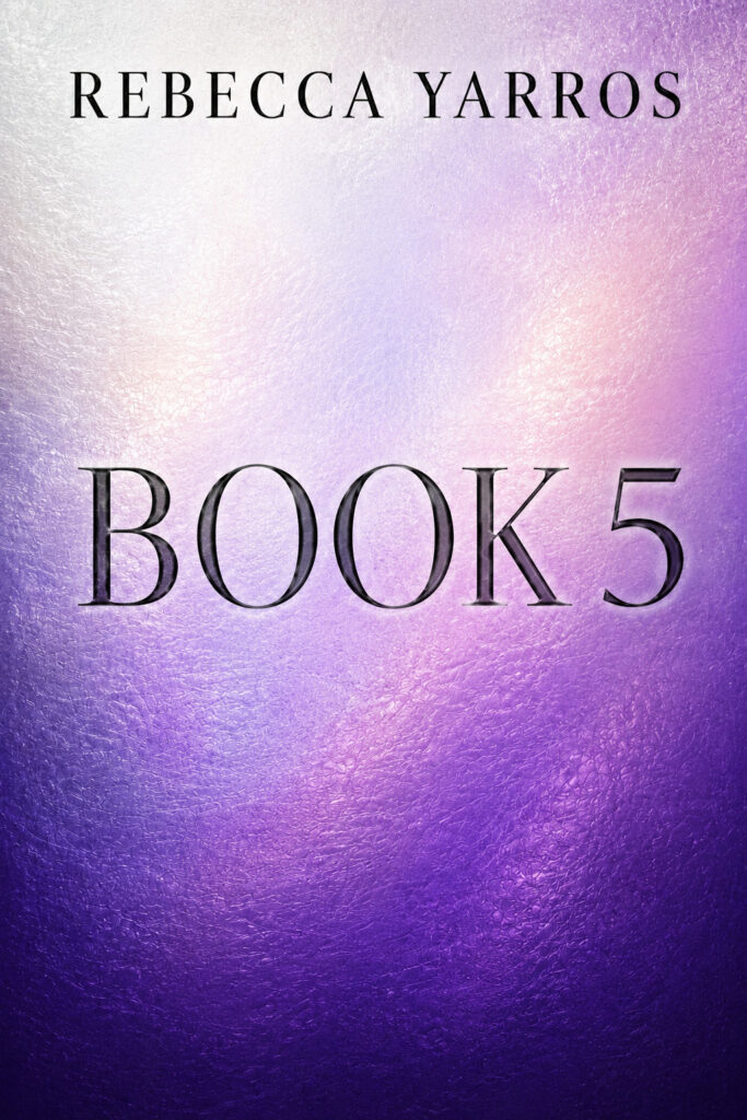
I think Rebecca Yarros chose Violet’s name for many reasons. Violet is the key to… well, everything. She is Violence, she is pure power, and she may eventually be able to wield or influence anyone.
Plus, I believe her incredible signet from Andarna is going to become very important very soon.
Are you ready to see the full series?
| |
| |
| |
| |
| |
| |


Leave a Reply